Stan rebrand and Hungry Eyes campaign which launched at the same time. We were briefed to create an ownable graphic system, which was distinctly Stan - so as to differentiate them from similar platforms who had recently implemented their own systems.
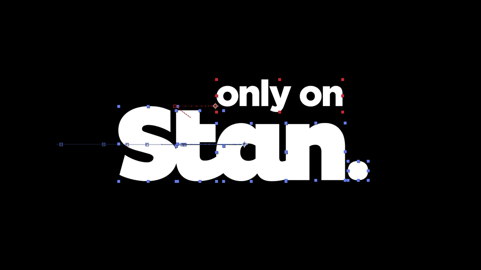
Focusing on the full stop of the ‘Stan.’ word mark. We were able to create a fluid, versatile device which animated playfully, clearly, and provided us with an extremely versatile device to keep the brand looking fresh - and not rehashing the same look and feel.


The round curves that form the word Stan will expand and explode into an array of superhero blue mixes, framing and interacting with Stan’s infectious content. A window to amazing content, viewers look past the electric Stan blue to view the amazing content within.
The Blue Curves are a versatile device which not only frames the visual, but creates an anchor for our brand and messaging.
The Blue Curves are a versatile device which not only frames the visual, but creates an anchor for our brand and messaging.

Interaction between the key art and the Stan branding is important and helps Stan to ‘own the show’, bringing the advertising to life.