
Tech at the speed of culture.
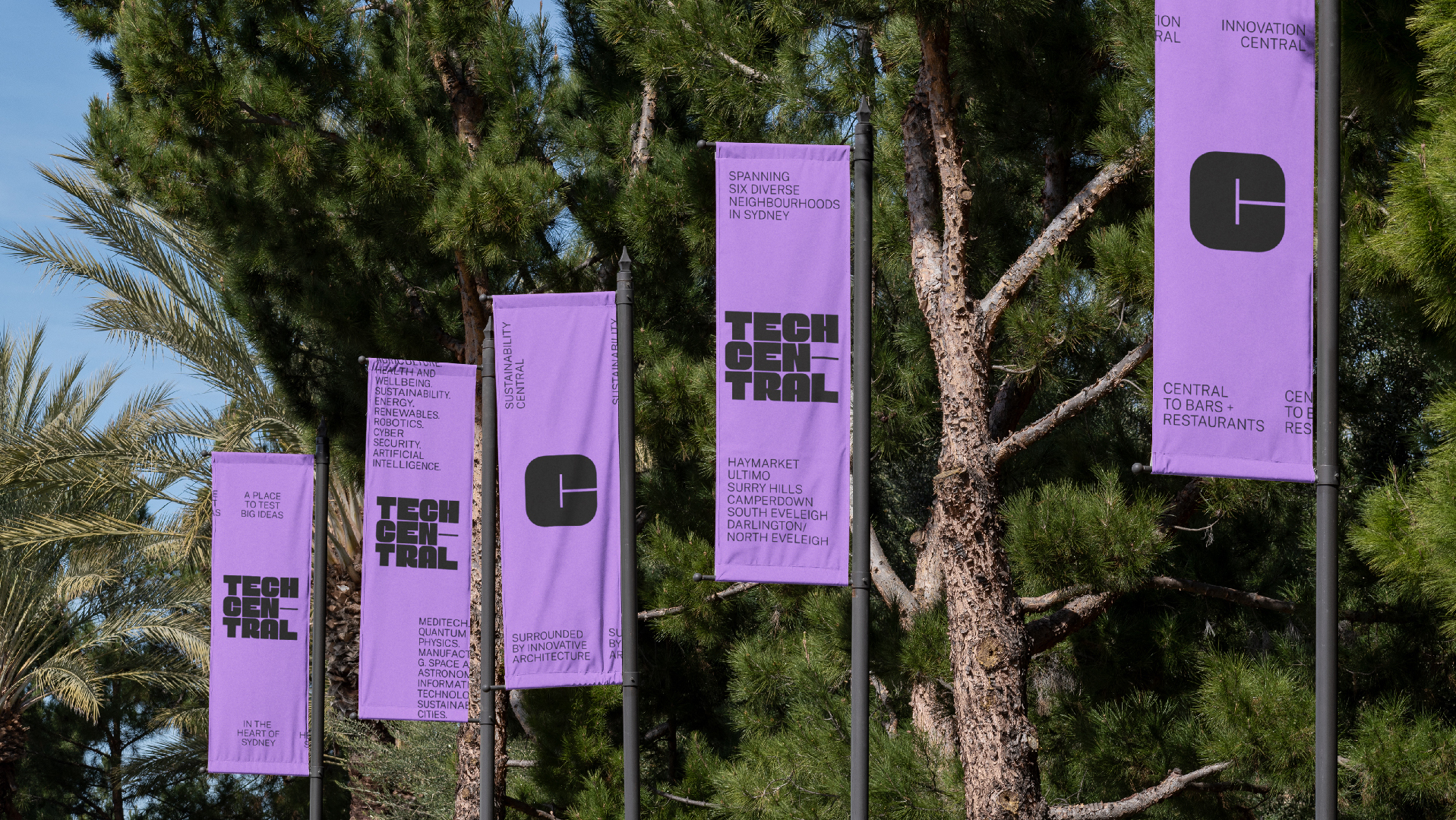
We needed to reflect the diverse communities with deep historical routes, we needed to present an attractive potential home for future industries and we needed to justify interest in international investment.The city life represented through type and language is designed to capture the mood, sounds, and senses of those urban moments taking place within Tech Central.
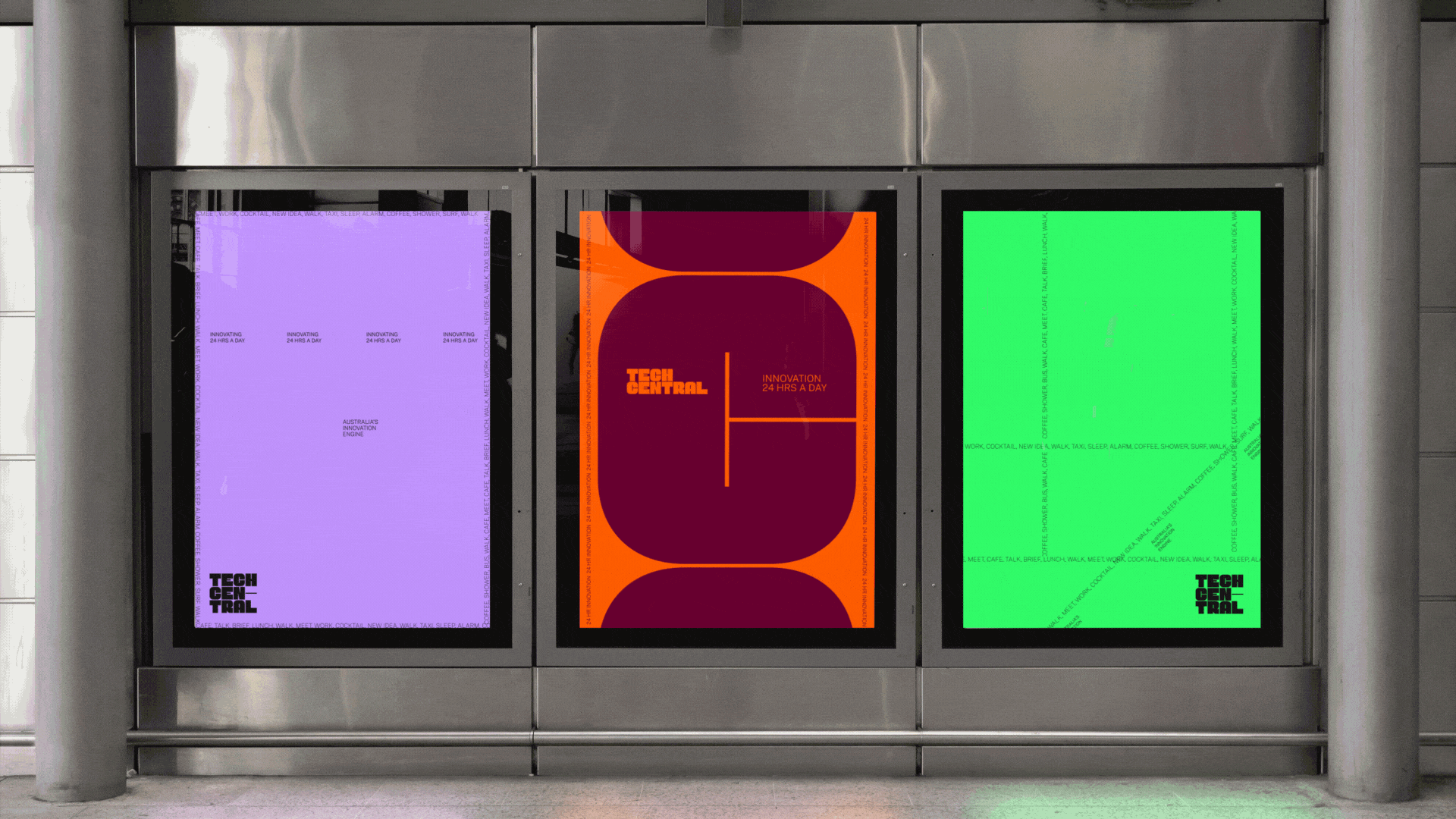
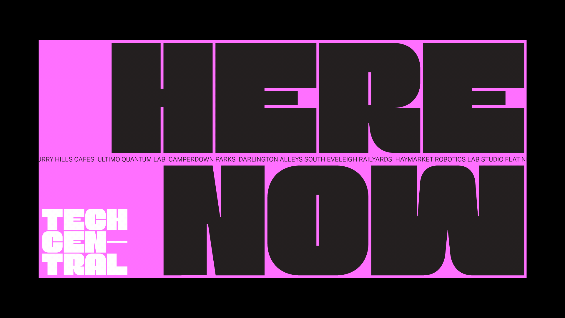
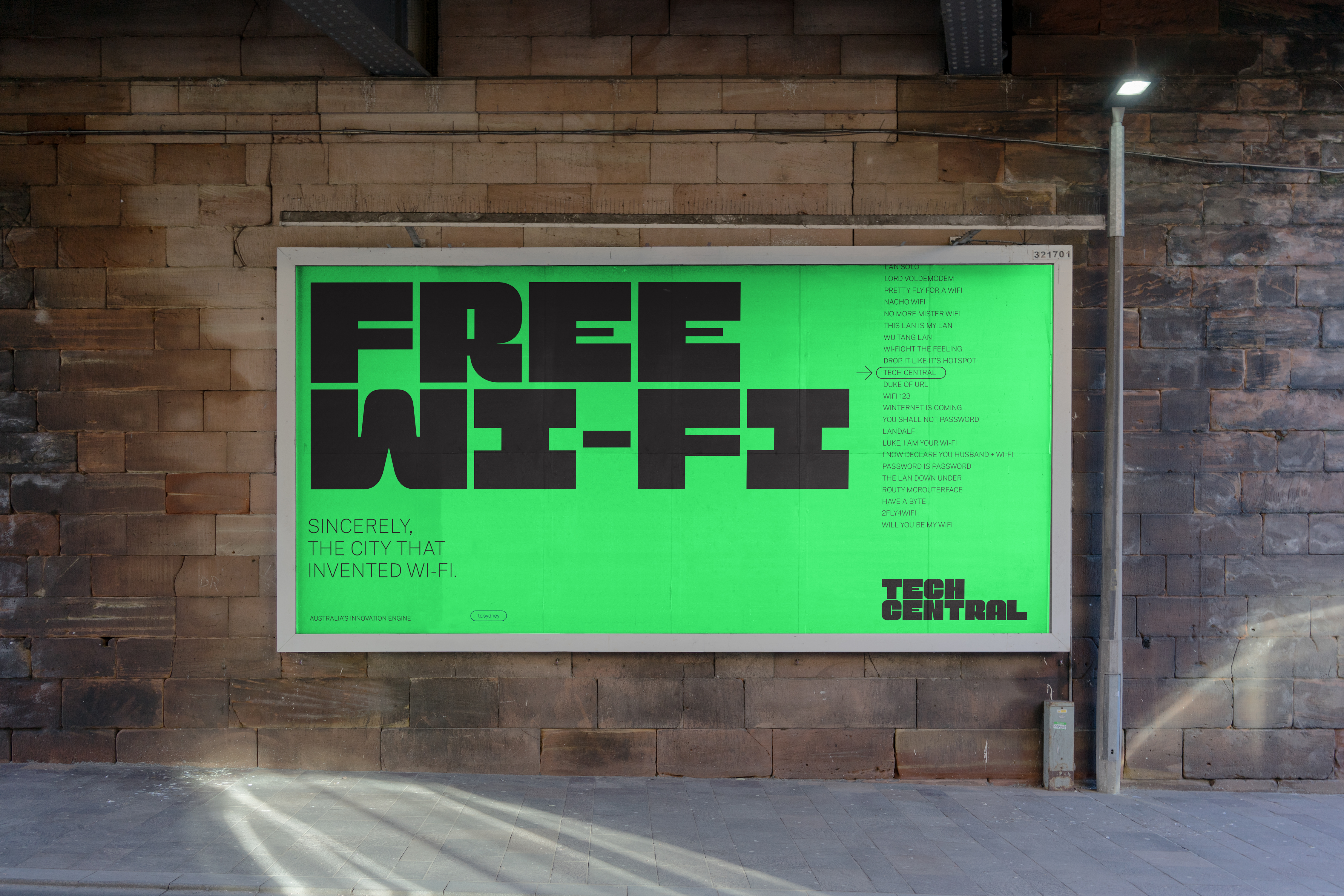
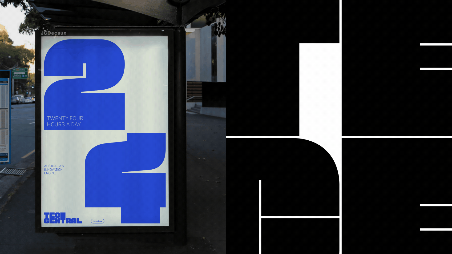
Uniquely, Tech Central is right in Sydney’s cultural heart, it’s all true-to-place in its depictions of an innovation precinct with an energy unlike any other. Visually, it’s designed to feel like a city in constant flow and action – and the language structures used allow for genuine stories of success and progress from the area to become vital throughlines.
The urban type.
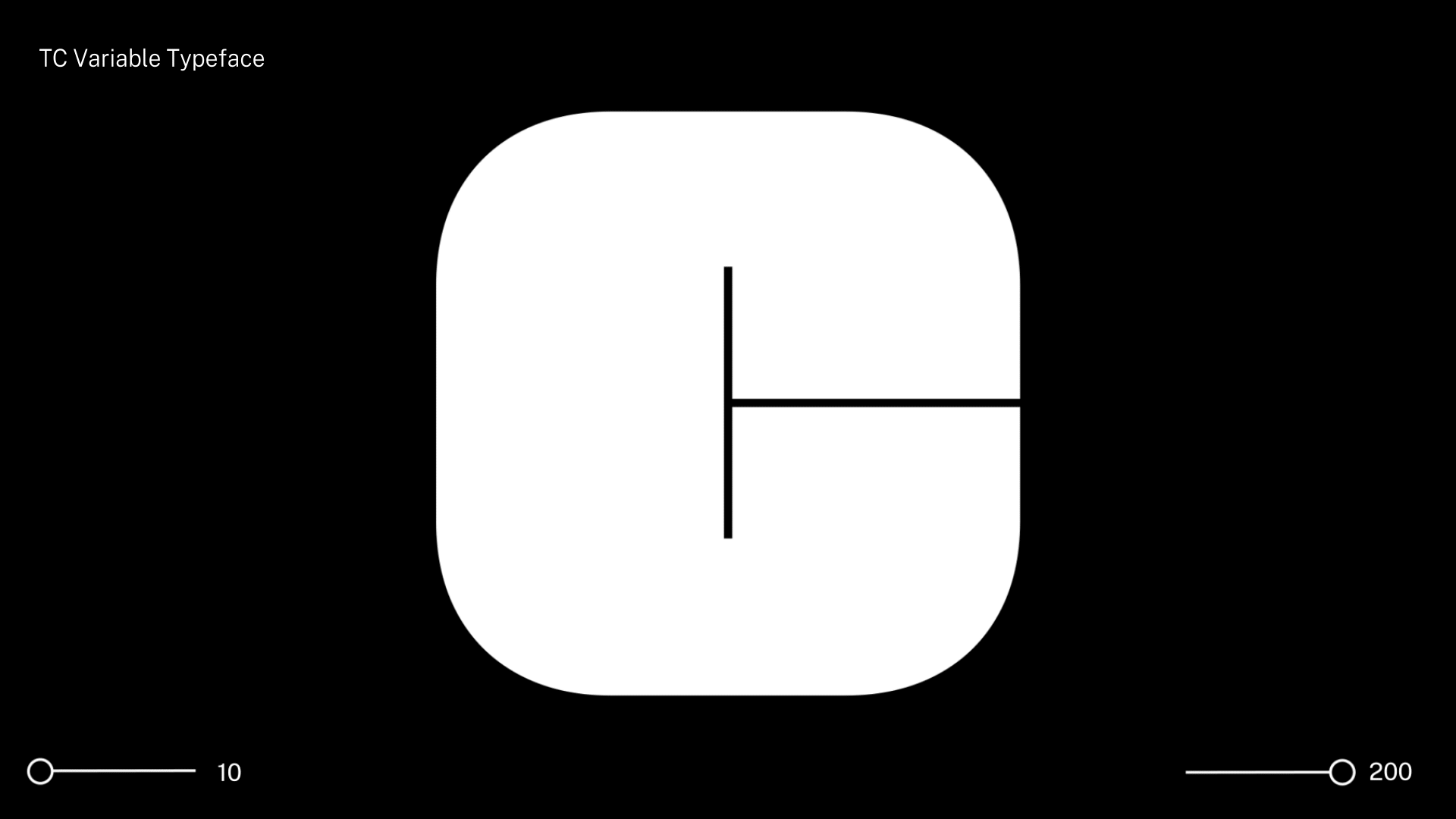
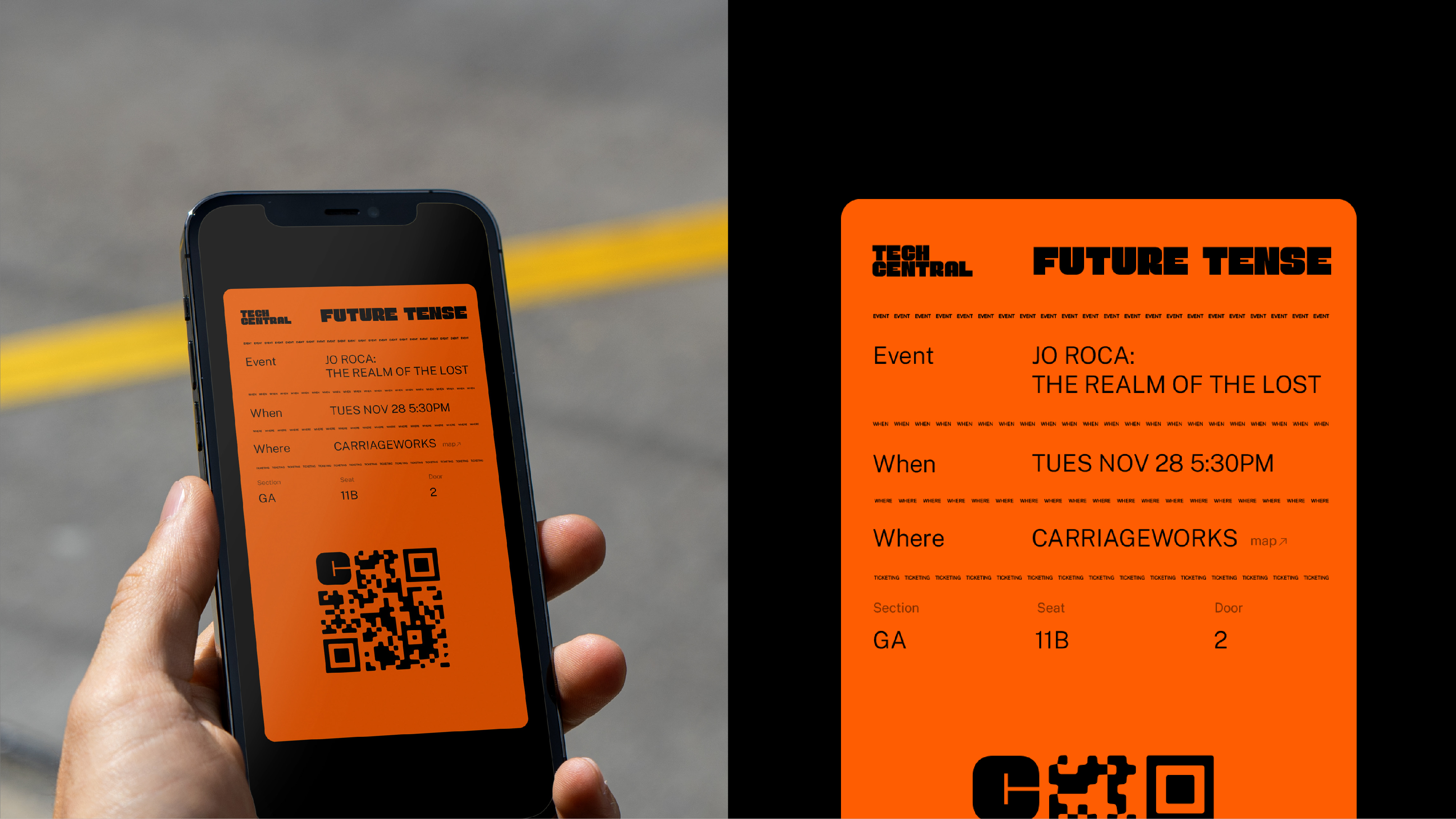
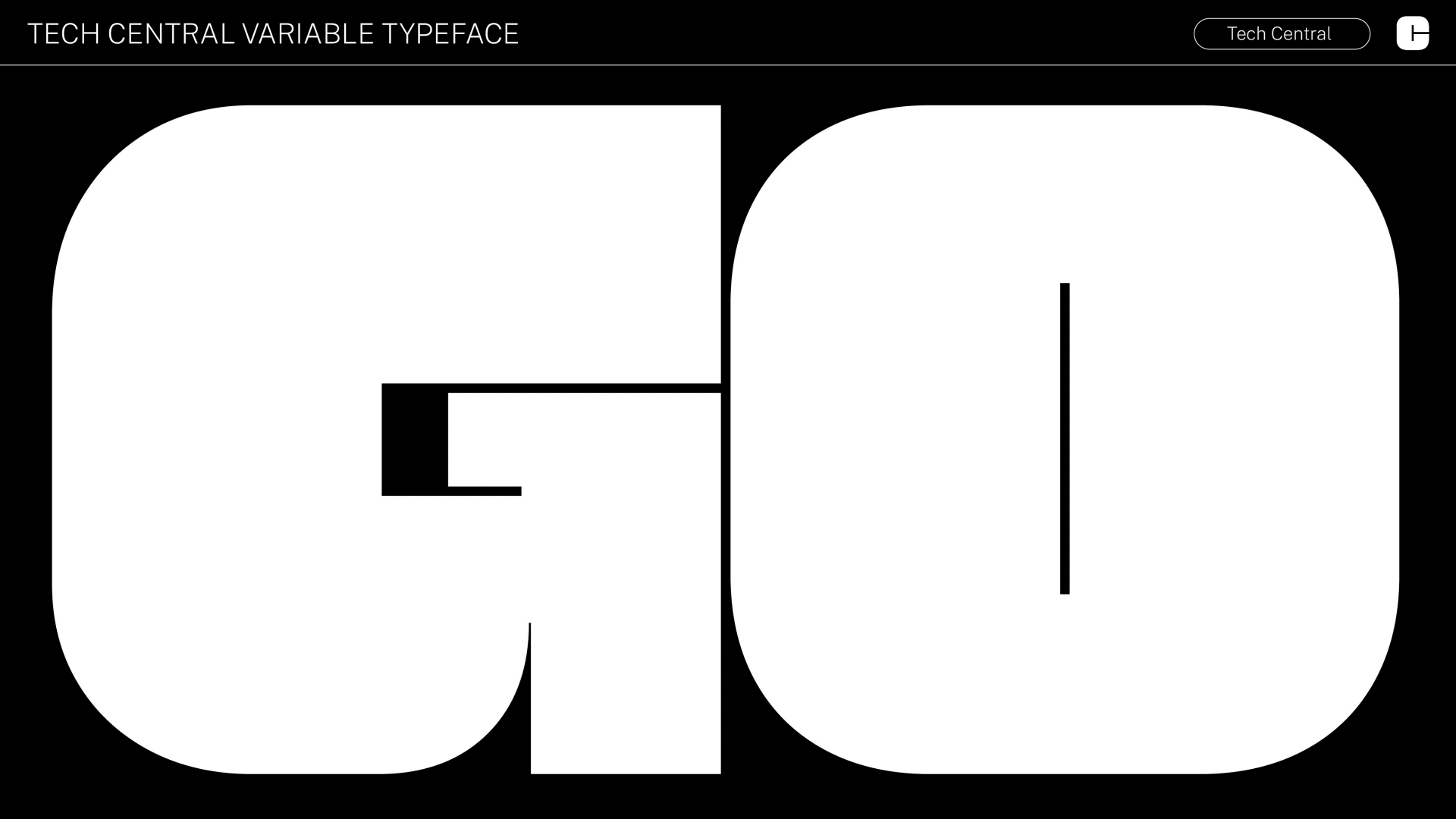
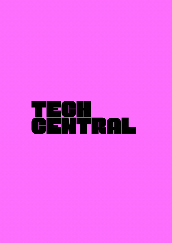
Tech Central’s iconic logotype has its origins in a typographic expression of the city streets and blocks – and it comes paired with a matching monogram, that is streamlined while still incorporating both the C and T.
Uniquely handcrafted for Tech Central, the bespoke, variable logotype is easily available for use by the precinct community – and it’s supported by the highly accessible Public Sans, an open-source Google font.

Studio: For The People
Role: Design Director, Motion